Coffee and Aneurisms
Magpie Coffee Roasters
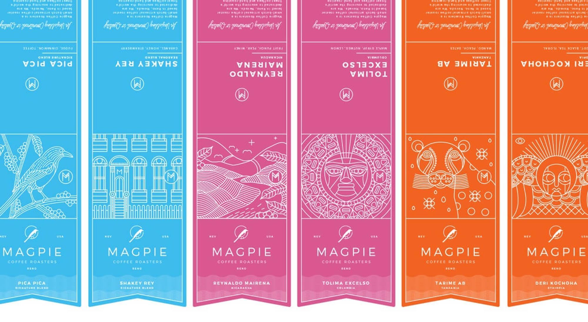
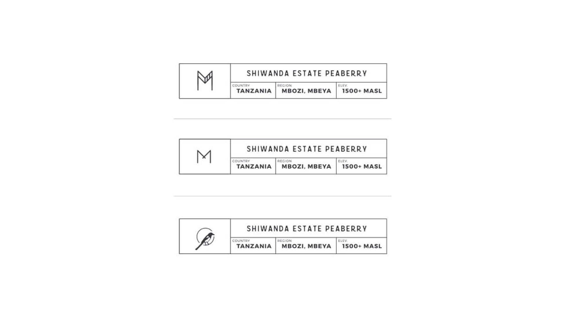
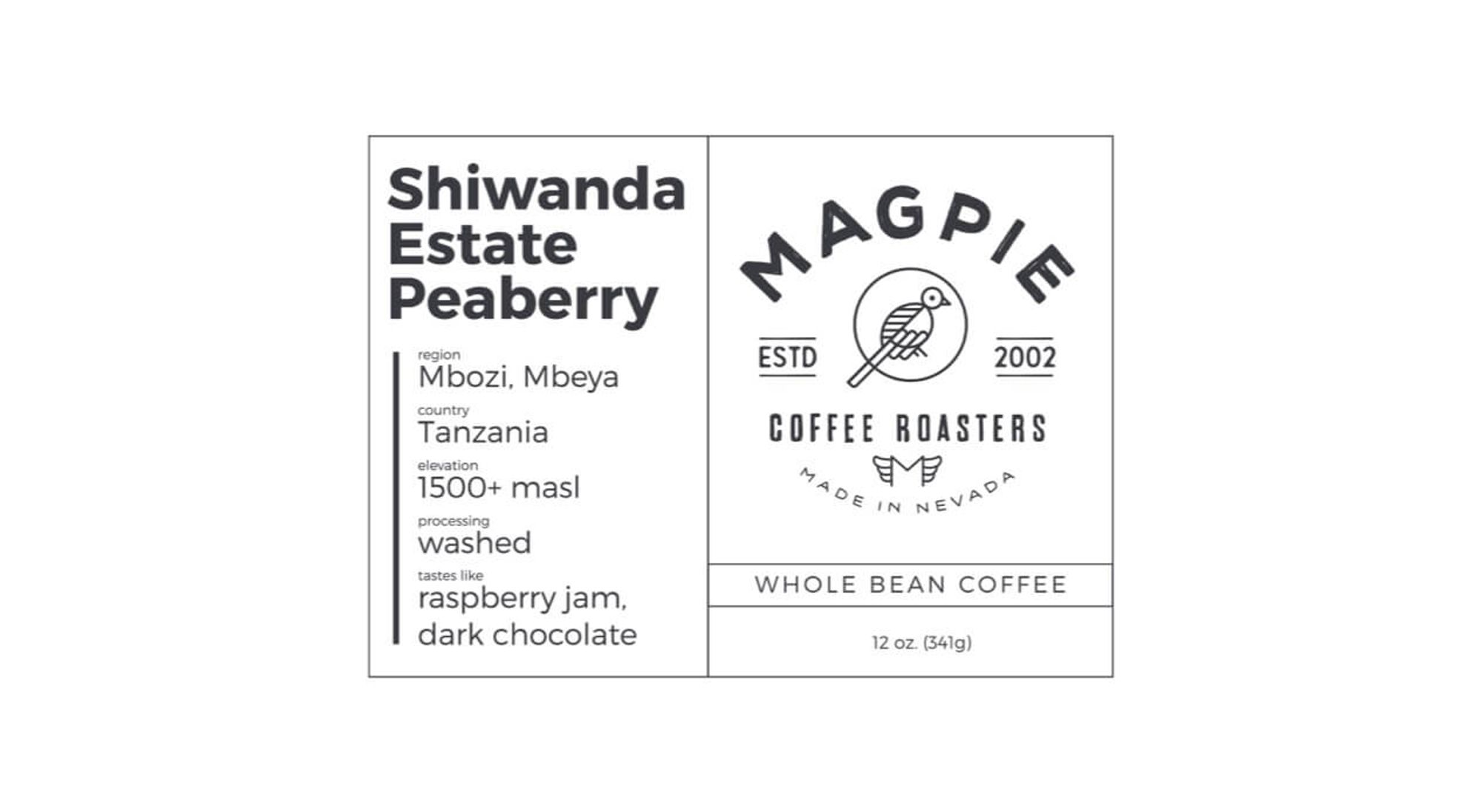
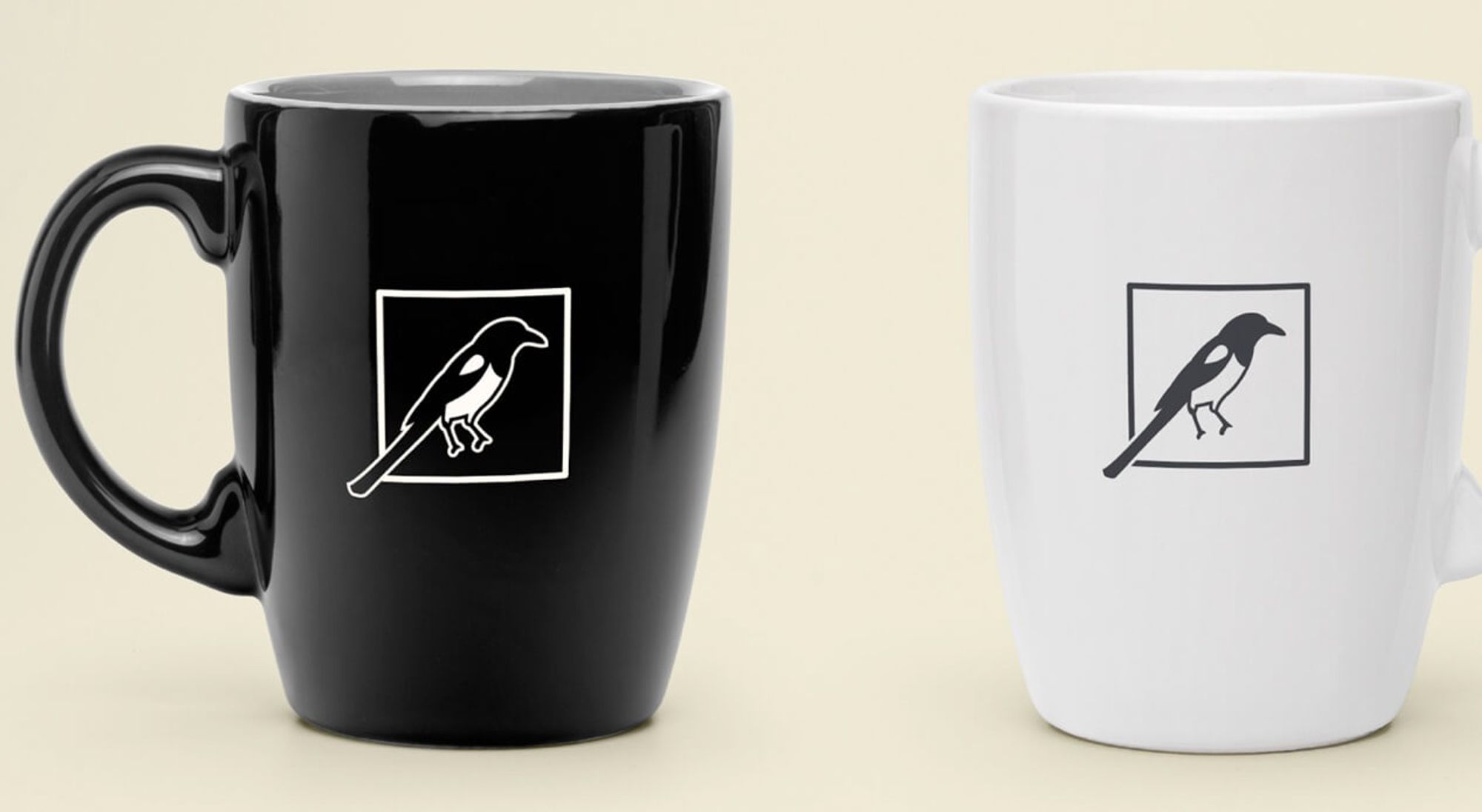
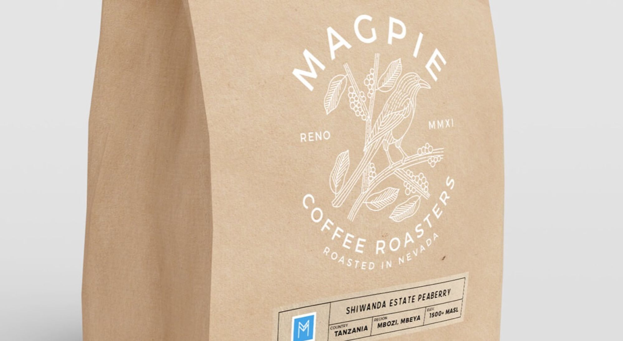
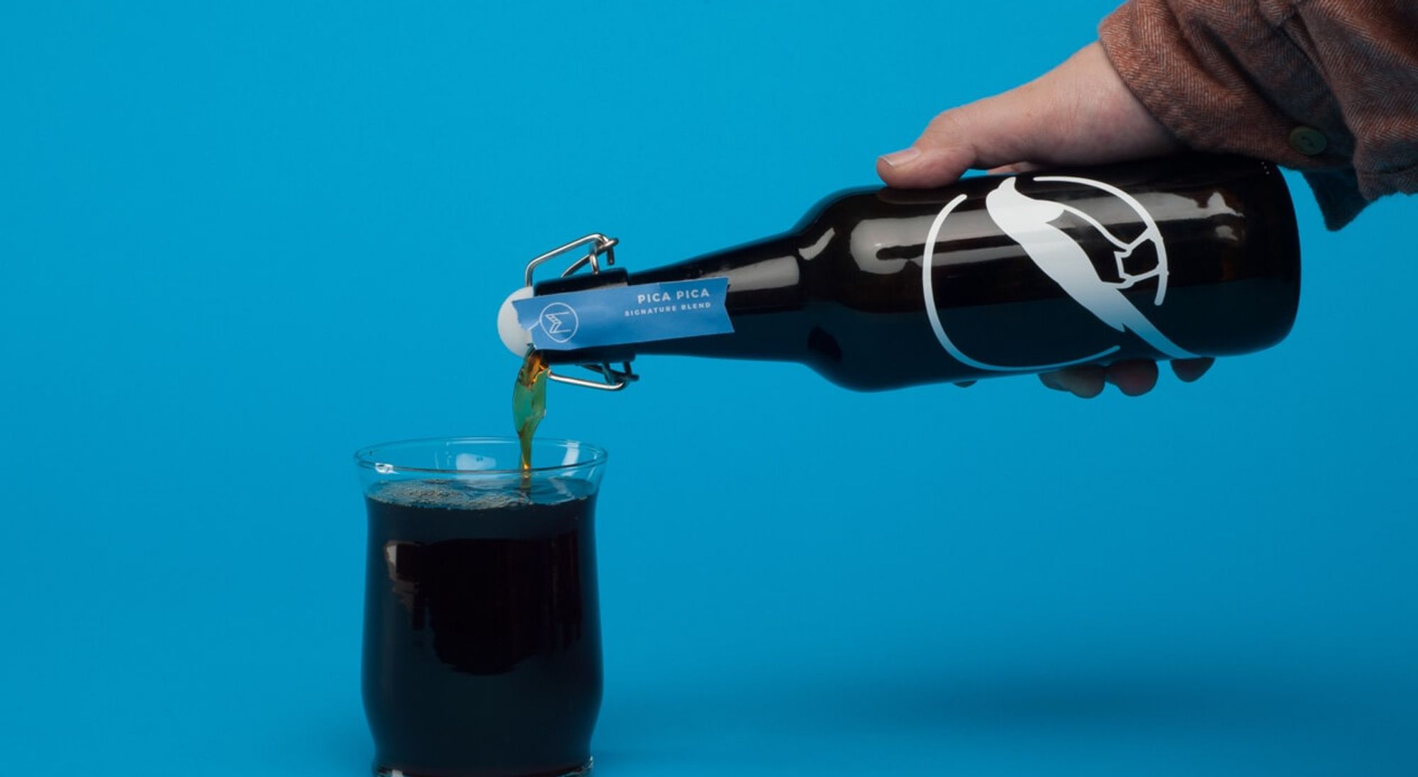
A growing coffee roaster, brand-new storefront, and "product testing" almost to the point of brain aneurysms (no, really), creating an identity for Magpie Coffee Roasters was less bravado, more art -- just like the coffee itself. Through creating a familiar symbol for the brand, as well as artwork that craves to be collected - we made the coffee aficionados at Magpie look as good as their brews taste. Keeping the known simplicity of Magpie in place while infusing their credibility and stature in the industry was imperative. We didn’t want to make them into something they weren’t.
Year
2017
Awards & Mentions
2016 Reno ADDYs - Gold - Packaging, 2017 Reno Addy's - Gold - Packaging, 2017 MUSE Creative Award - Packaging Series / Campaign
Location
Reno
Nevada
United States
Industries
Food & Beverage


