We refreshed the look of Coffeebar to match their attitude. Bold, bright, yet sophisticated and refined. With such a growth taking place in the company, and a dedicated, loving fanbase - it was of upmost importance that we complete every action with strategy. Our measure twice, cut once mentality was something we were taking into account every step of the process.
Award-winning Ecommerce UX for Regional Coffee Roaster
Coffeebar

Being a group of creative professionals, its only natural to be fueled by caffeine and cold brews. Coffeebar is a supplier of just that— not to mention wine, baked treats, good times and great memories with even greater friends. At the start of Summer 2017 when Coffeebar was gearing up to open their 5th location we began a partnership to achieve an enhanced social presence and build a brand new website in preparation for the much-anticipated arrival in Silicon Valley.
View WebsiteYear
2020
Awards & Mentions
2017 - Shopify Commerce Awards - Best UX Through Storytelling
Location
Reno
Nevada
United States
Industries
Food & Beverage

Identity Exploration Re-crafting the look

Colors to match coffee’s personality
In addition to Coffeebar’s signature orange, brown and tan color scheme, we introduced some pronounced secondary colors because coffee offers the ideology of comfort and energy of movement all at once.
You can never go wrong with badges
Badges are great for everything from identity extension, to website ornamentation, to clothing designs or patches.

A human approach
While we wanted to keep things modern, we also didn’t want to erase the human element. That human element is what differentiates all of Coffeebar’s locations from so many other coffee shops. We thought some handwritten elements would carry that ideology accross their brand.


One of the goals we established when we first met with our pals at Coffeebar was the desire to have a kickass website.
We wanted something that highlighted all locations, encompassed everything a customer could look for, stand out above the ordinary and, of course, look amazing.
A taste of the entire site in one page
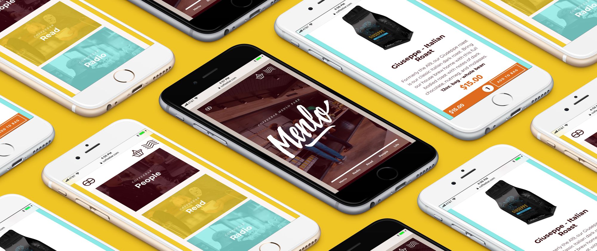
This is the first page Coffeebar’s customers see. It not only gives them a taste of the custom video components, eye-catching transitions and integrated handwritten elements, but it also highlights the shopping experience and invites them to check out Coffeebar’s individual locations, blog, ideology, spotify favorites and lifestyle portfolio.
Website Architecture
This site starts with the expected. You’ll find the contact, about, culture and shop pages quickly. Then it adds some pizazz. It includes pages dedicated to the senses— photos to look at, playlists to listen to, news to read about and menus to salviate over. As if that wasn’t cool enough, each of Coffeebar’s location pages link to these experiences, displaying corresponding examples of each. Lastly the site finishes off with some truly special surprises, roadtrips and brew guides, but you’ll see those later.
Six locations. Six stories. One brand.
Coffeebar has done a fantastic job of keeping their brand consistent throughout each of their locations while making each space uniquely fit into the local area. Our challenge was to do the same thing digitally.
We chose Shopify as the platform of choice.
It has a beautiful back-end that gives us the ability to hand-craft the shopping experience, and staff the ease of use. (Added bonus for their top-notch analytics, data reporting and ecommerce insights. )
Shop coffee, goods or tools
The shopping experience is well organized into three categories and kicks things off with a couple different suggestions. Each product page includes pictures, its story and a sticky header that displays the most important details 100% of the time as you scroll to explore a product. Which means, yes, customers can add that baby to cart no matter where they are on the page.
Clothes, pins and mugs
Its always sweet to see artwork on items people bring with them (or wear on them), because that means theres’s a higher chance that art will touch more souls. Here’s a couple products we merged with our badges and typography as proposals to add to Coffeebar’s online store.
Spotify Integration
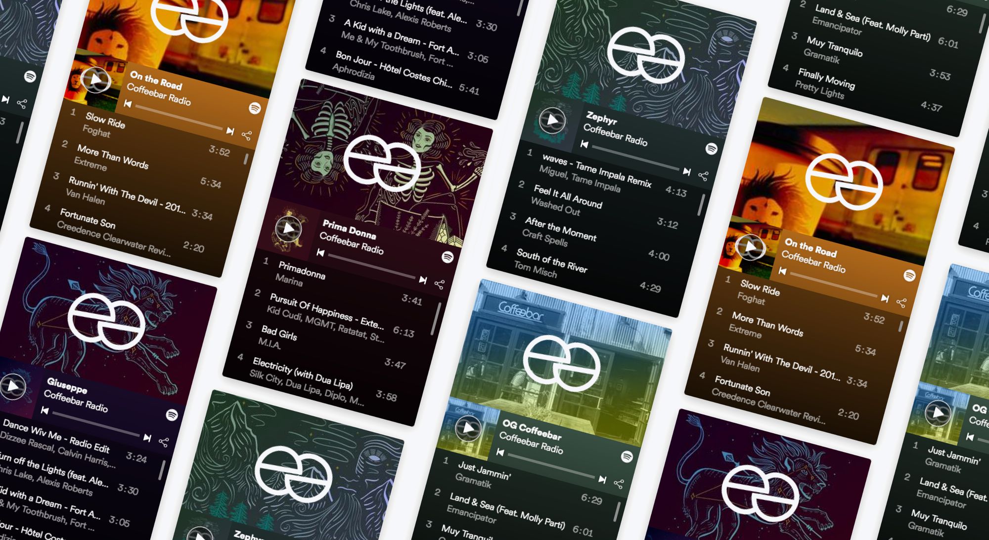
What’s a coffeeshop without rad music? We embedded Coffeebar’s favorite playlists with each location page, suggesting a set of songs that will always bring you back to your favorite coffee artists.

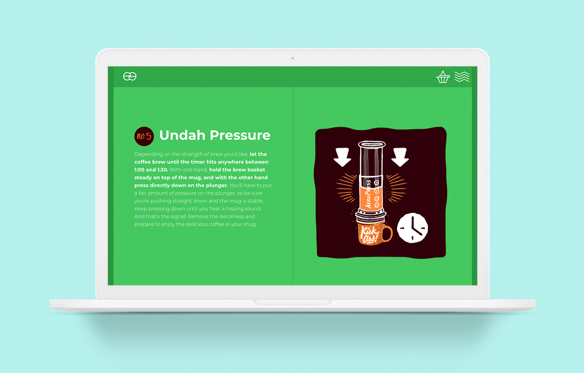
The coolest brew guides you could imagine
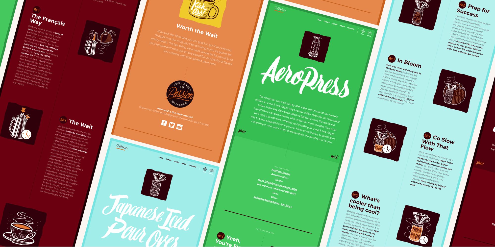
Ever wonder how you’re favorite coffee spot makes their drinks so perfect? Well here’s how. Visit Coffeebar’s brew guides page to explore four in depth brewing methods. And if you’re already a master brewer, at least check it out out to admire the awesome handwritten elements.
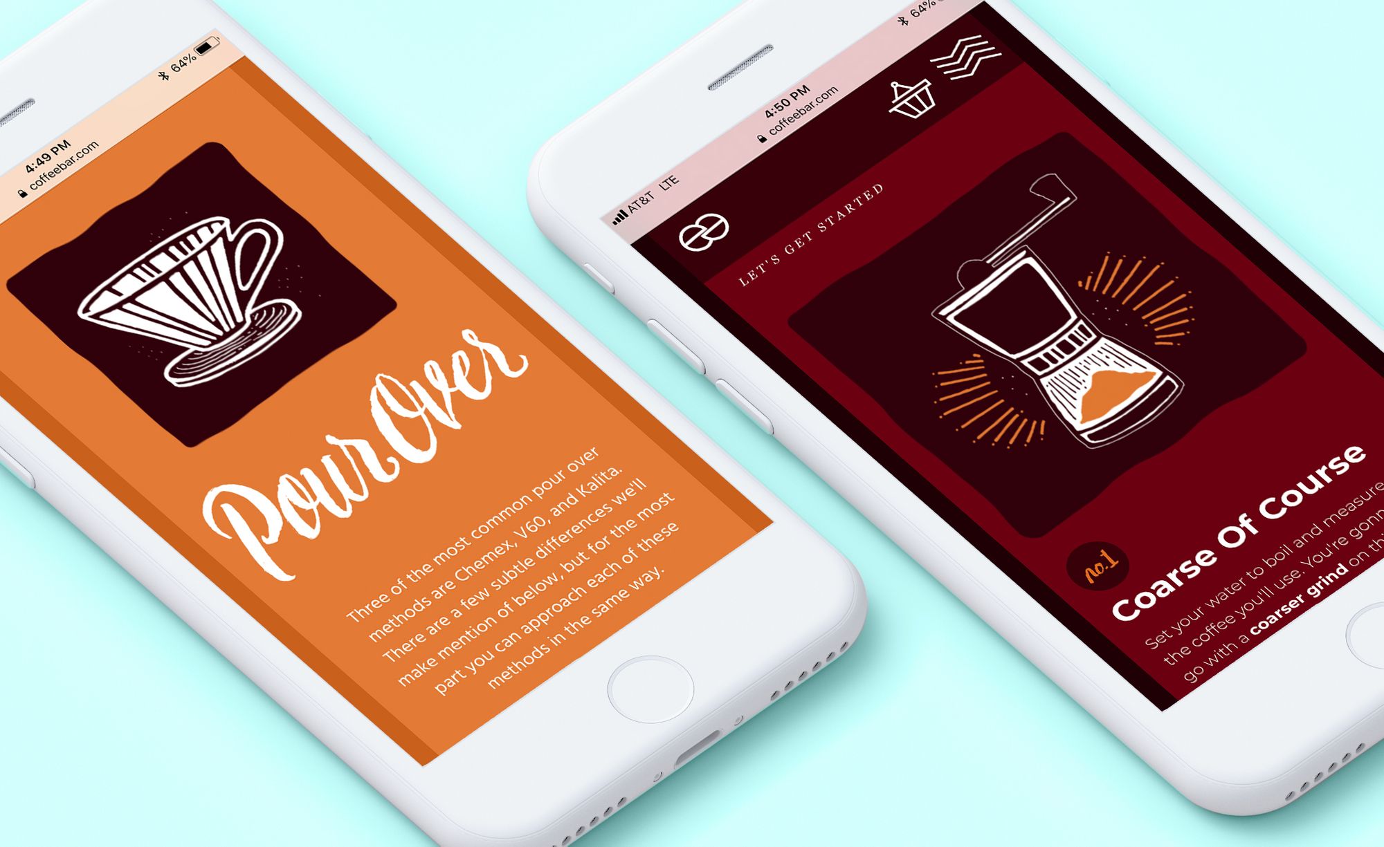
The icing on the coffee
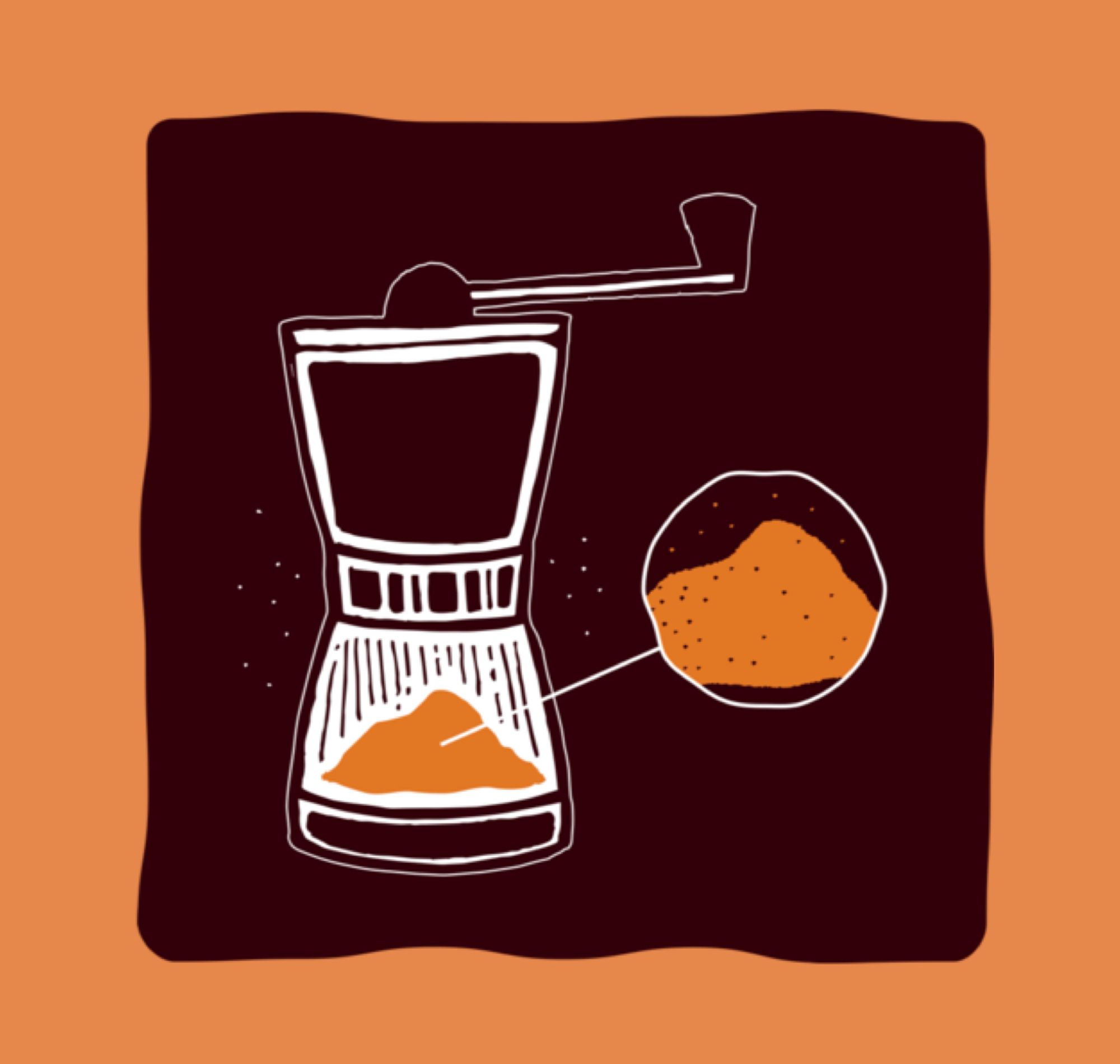
As if detailed steps and a complete instruction list weren’t enough, the illustrations that pair with each step blew it out of the water.

How it works
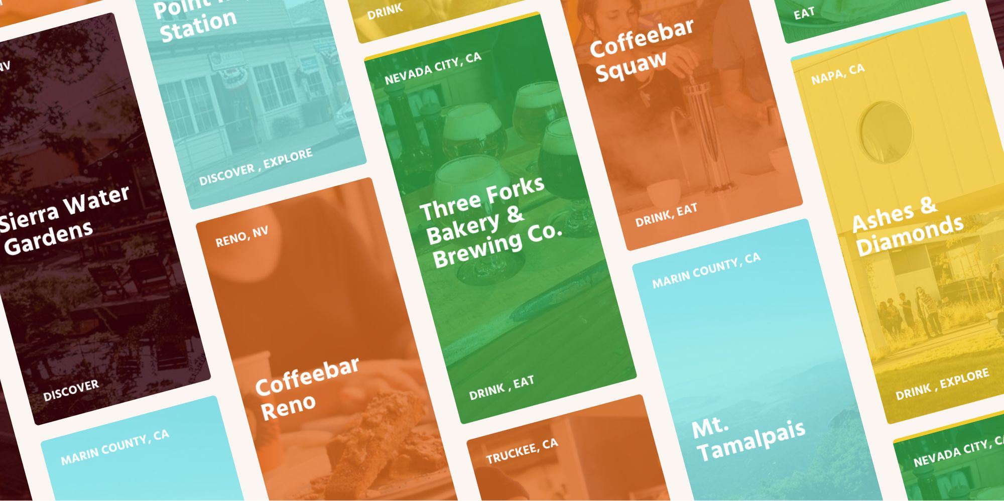
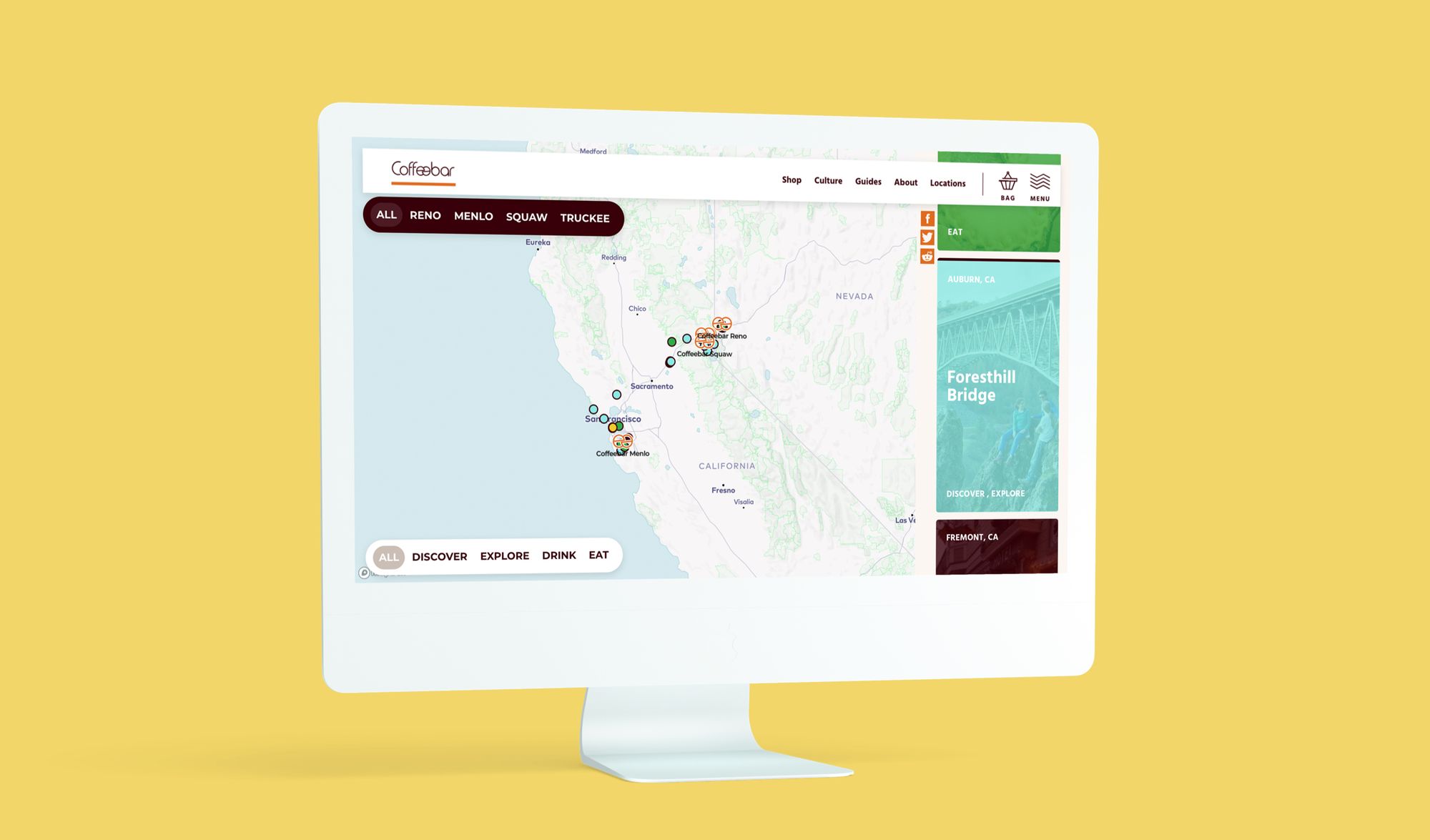
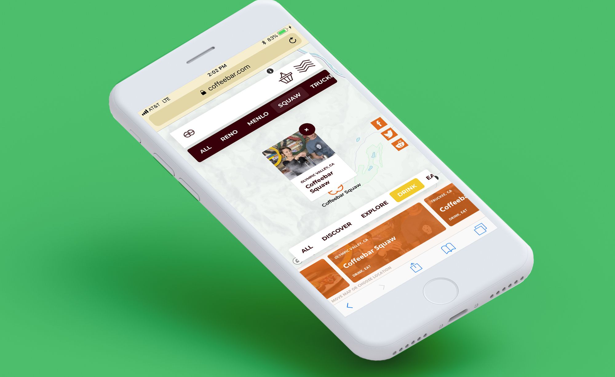
When you first visit Coffeebar Roadtrips you’ll see a map with a bunch of stops Coffeebar employees handpicked. Each stop’s point is color coded brown, blue, yellow or green which corresponds to the stop type: discover, explore, drink or eat. Filter by location, or type, or both. Zoom in or out, and scroll right or left. You can even click on each point to see a preview of the stop, its name and city.
Details for every stop
There’s even a corresponding card that scrolls to display whenever you click on a point. It offers you all the details you need to know, its website, a link to google maps, which employee suggested it and why.
There was a lot of fun with photo and video on this project.
We were able to work with on-location and studio photography as well as cinemagraphs, custom video and timelapses.
Shooting On-location
Great for website and blog photos, we shot everything Coffeebar where all the magic really happens.
Studio Photography & Cinemagraphs
Great for social media, we shot some messy, but worth it, looping cinemagraphs and in-studio scenes. The cleanliness of the solid color backgrounds and attention-grabbing hand placement allowed us to create a whole new feel and interest.
The reel deal To show how special each location is
Each coffeebar location got its own video. Some are captivating timelapses while others show just how cool the shop and their employees really are.
