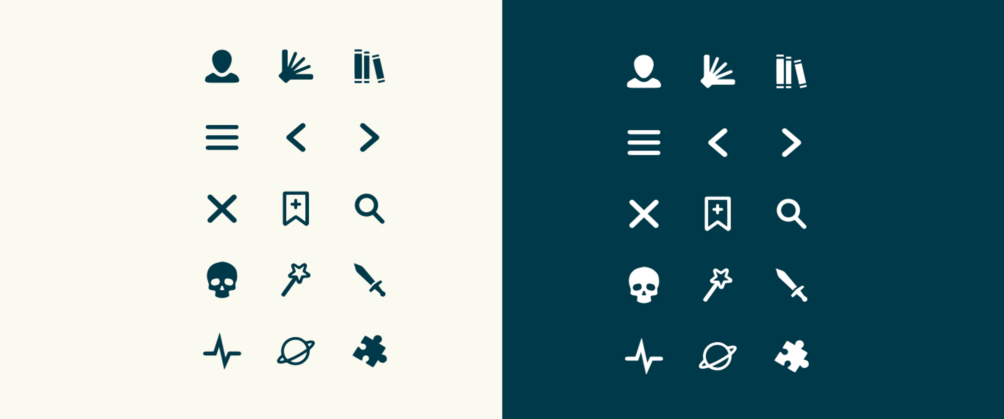
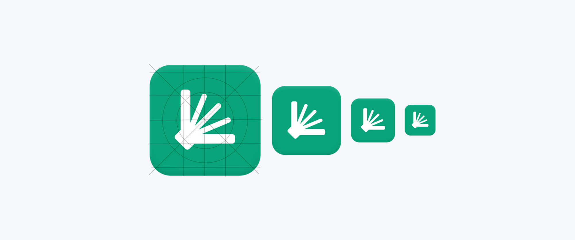
The icons take the approach of being recognizable and functional. The simplicity allows for the tone of the content to be at the forefront.
A Story Worth Sharing Through UX
Lorable

Lorable is a storytelling app developed by the Northern Nevada based startup to engage both readers and writers with interactive plot building. Through strategic branding, material design, and clarified theming, we helped create an app experience that is engaging and easy to explore.
View Website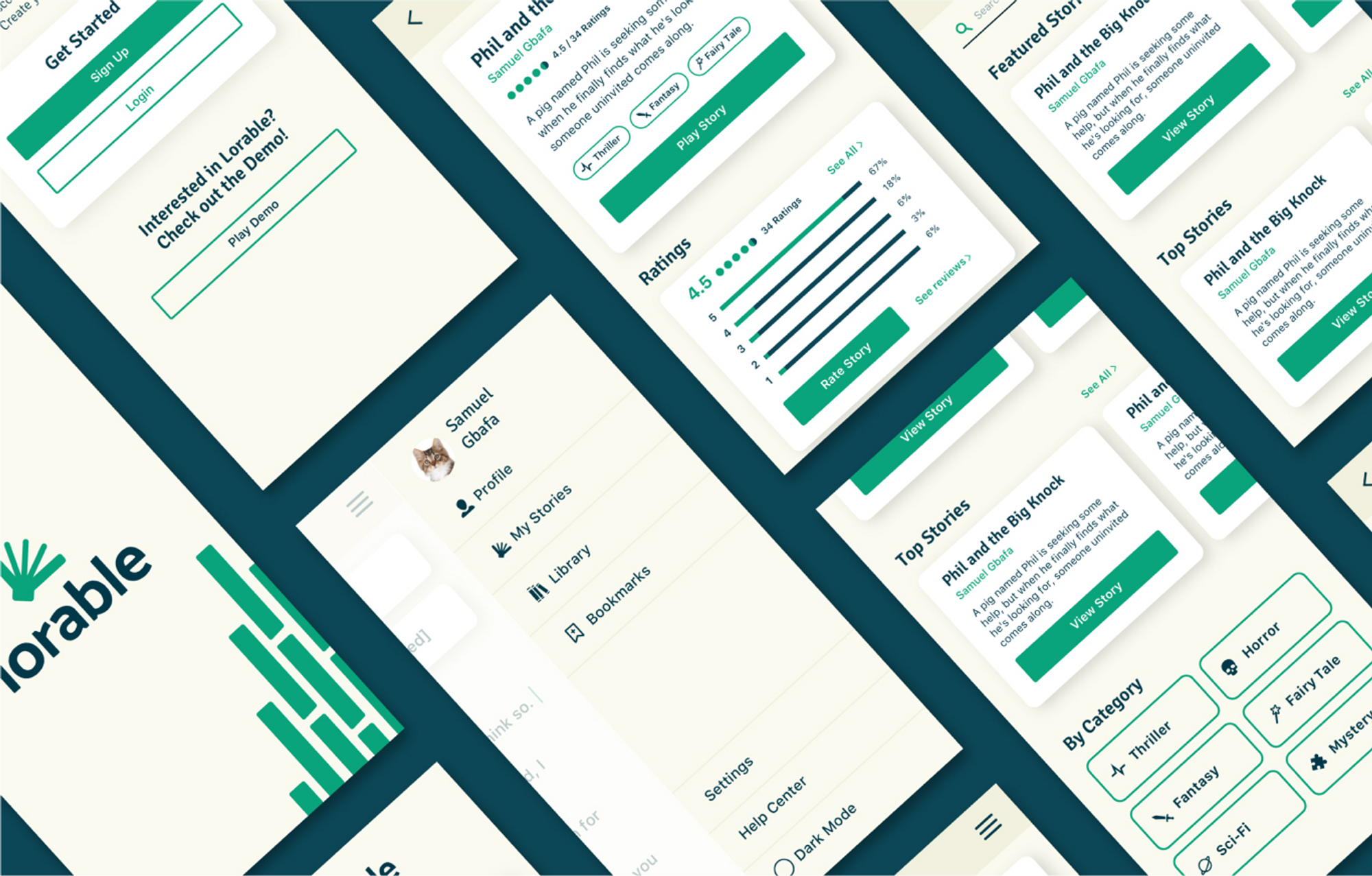
Lorable’s iconography reflects the clear shapes and style to match its brand identity.
Let's Talk Color
Theme & Palette
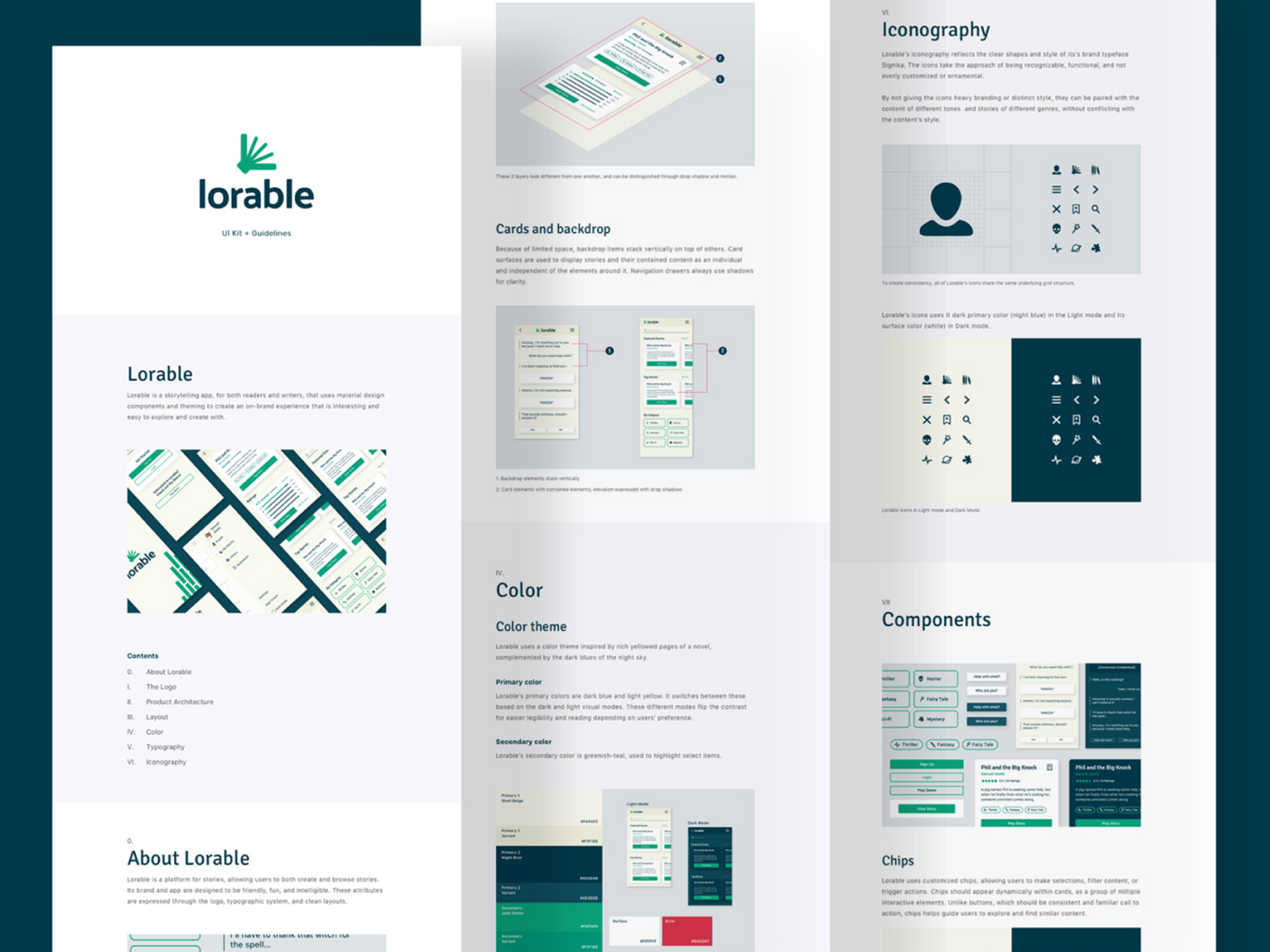
Lorable uses a color theme inspired by rich yellowed pages of a novel, complemented by the dark blues of the night sky.

The interface must adapt to different lighting conditions to avoid poor readability or glare
Designing for dark mode allows for content to be easier on the eyes in dimmer environments.

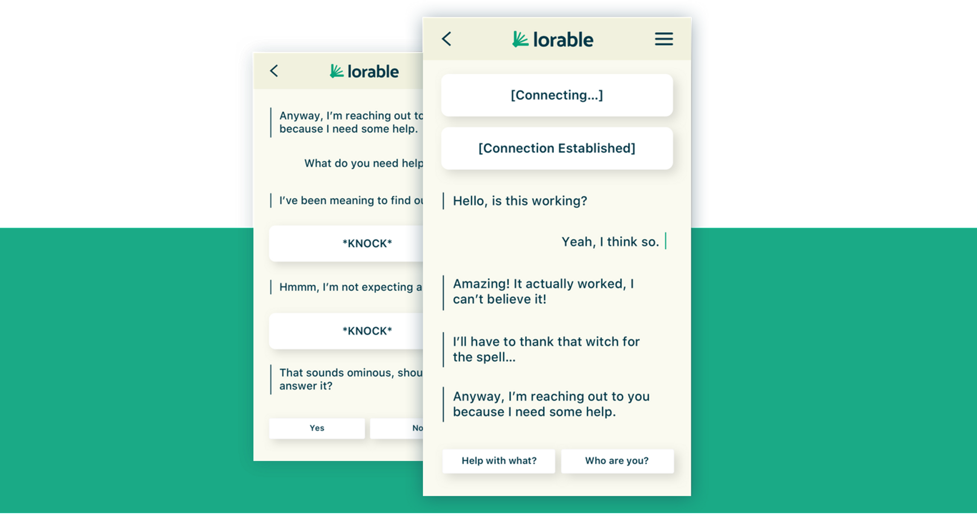
Lorable’s stories are developed based on casual human conversations so users are acclimated effortlessly.
The UI we created assists in guiding the user through a natural flow of conversation.
